The Peerage Cares program is a philanthropic initiative founded by Peerage Capital and established from their aim as a corporate family to “Engage, Empower and Effect” the community in which they work, North York, Toronto. The objective is to make an impact through providing resources – financial or personal time – to programs or events that will directly benefit children and families living in the area.
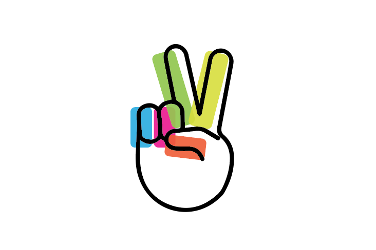
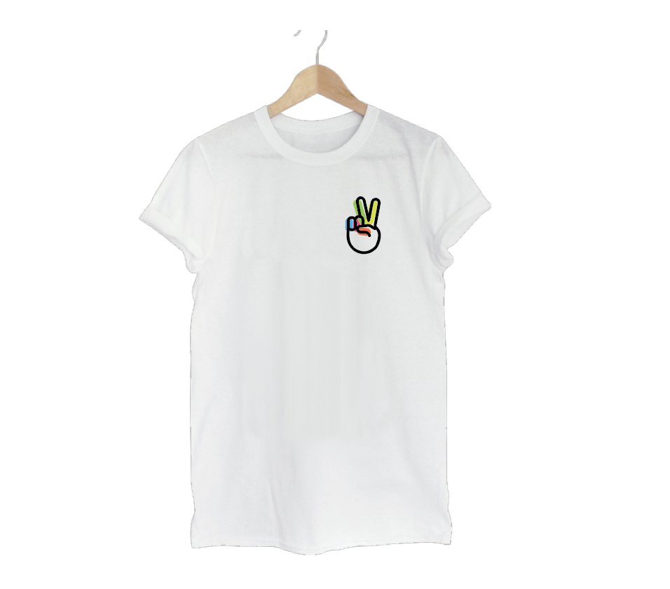
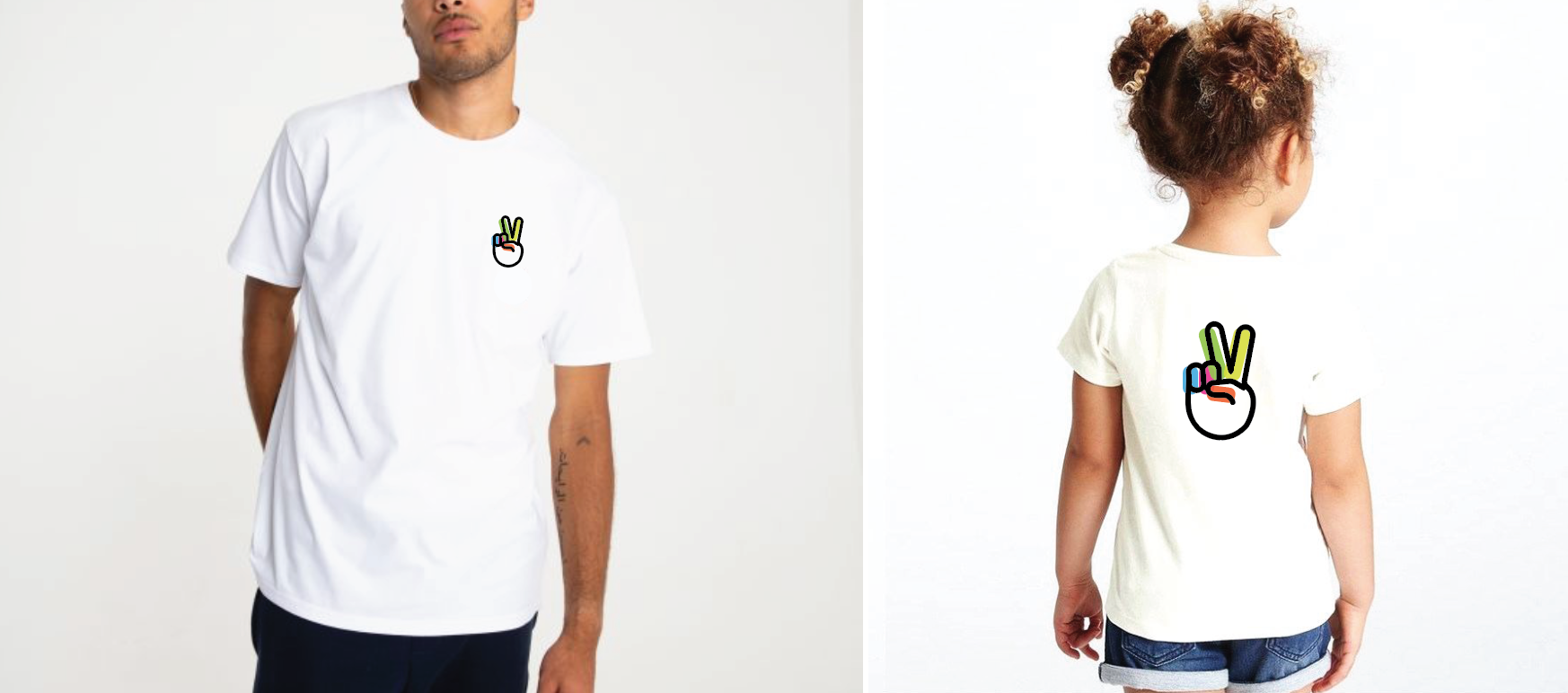
The Peerage Cares board agreed that it was most important for the identity to appeal to children and youth, ages 6 - 18. It should be vibrant, eye catching, approachable, exciting and inclusive. The icon needed to function as a stand alone graphic when applied to items like t-shirts, bags and pins. It should not look corporate, stale, outdated, exclusive or intimidating. Sarah chose the symbol of a hand giving a peace sign for its iconic popularity through time and for the symbol's representation of courage and empowerment. The simple, thick black outline of the hand is inspired by Keith Haring's artwork from the 1980s, which is now widely recognized and almost universally embraced as an accessible visual language that supports inclusivity.
The Peerage Cares board agreed that it was most important for the identity to appeal to children and youth, ages 6 - 18. It should be vibrant, eye catching, approachable, exciting and inclusive. The icon needed to function as a stand alone graphic when applied to items like t-shirts, bags and pins. It should not look corporate, stale, outdated, exclusive or intimidating. Sarah chose the symbol of a hand giving a peace sign for its iconic popularity through time and for the symbol's representation of courage and empowerment. The simple, thick black outline of the hand is inspired by Keith Haring's artwork from the 1980s, which is now widely recognized and almost universally embraced as an accessible visual language that supports inclusivity.
More Creative + Design projects:
