Sarah has been the Creative Director at Peerage Capital since 2017. This role has afforded her an exciting, entrepreneurial, agency-like opportunity to provide marketing, art and creative direction and consulting to multiple brands. The Peerage portfolio includes companies involved in pre-construction and resale real estate, wealth management and self-storage.
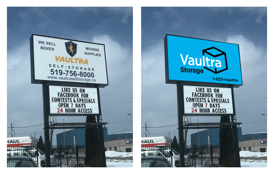
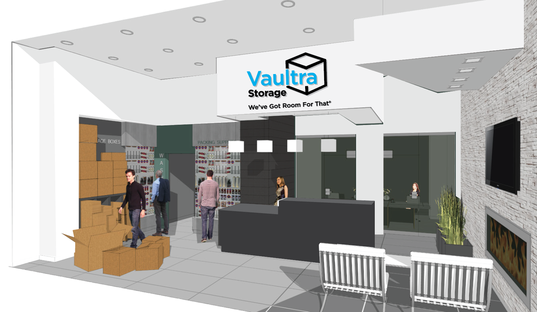
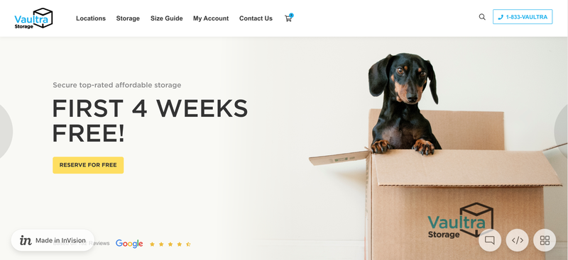
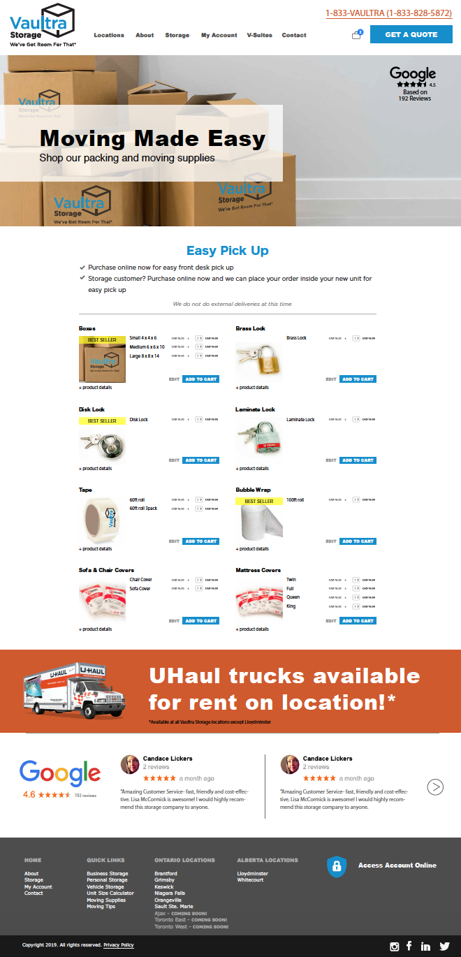
In 2019 Sarah led the rebrand for Peerage's self-storage partner, Vaultra Storage. The project involved designing a new logo, providing creative direction for facility updates, leading the redesign of a new website (slated to go live in October 2019) and laying the foundation for a new social media marketing strategy. Vaultra Storage is a growing Canadian storage operator with nine facilities in rural locations across Ontario and Alberta. They are rapidly expanding into urban markets, with several high profile plots of land slated for development in the GTA that will be opening their doors in 2020 - 2021.
The old logo had several issues; it was cluttered, outdated, masculine appearance and had a strong resemblance to the RBC logo. Knowing that the majority of storage customers are women and that the brand will be entering into the urban markets, where it is currently has no brand equity, it was time for a rebrand.
One of the biggest challenges with this rebrand was gaining consensus from all stakeholders from Vaultra and Peerage Capital. Coming up with a fresh identity that was supported unanimously and enthusiastically was a challenge. After conducting market testing through Ignite, we were able to confirm that there was no brand recognition or equity in the GTA with their old logo. The survey showed that the brand name tested quite well for it's uniqueness and conveyance of security and tested poorly for approachability and friendliness.
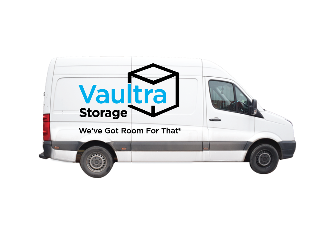
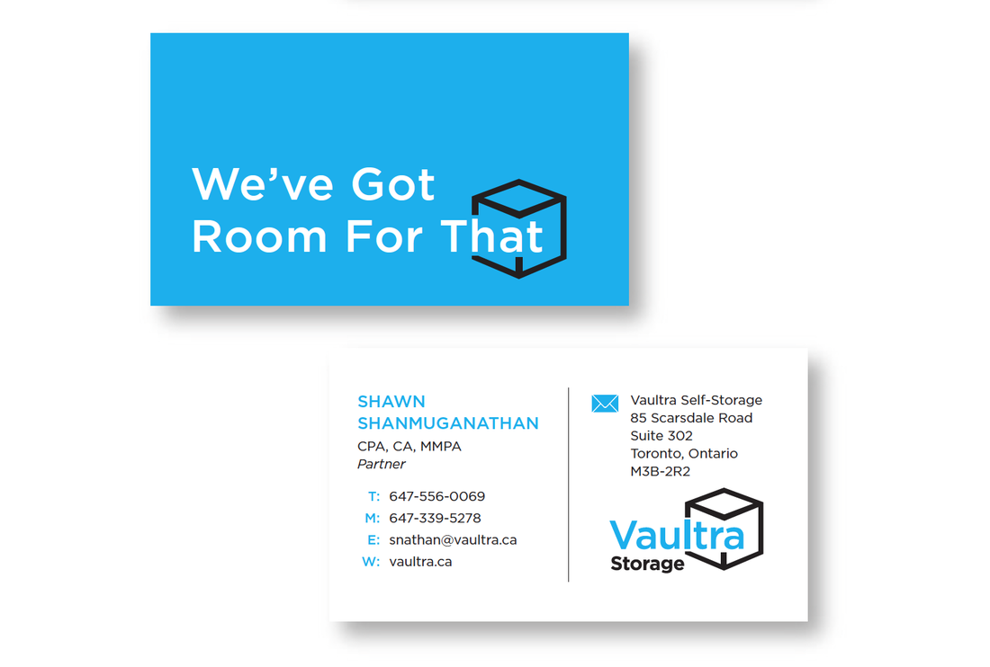
The team agreed to keep the name and redesign the logo with a clean, approachable, contemporary look and feel. This was achieved through the use of a modern medium width typeface, set in lowercase with cyan, black and white, a strong, contemporary high-contrast palette. The symbol of the cube which references both a simple moving box and the storage unit containers themselves. It is unremarkable in and of itself, however the way it is creatively integrated into the wordmark, gives the identity a subtle edge of sophistication that is needed to compete with large well established competitors like Public Storage and Bluebird in urban markets. To help achieve consensus for the new logo amongst all stakeholders, several iterations of the modernized new logo were tested in two additional rounds of surveys.
This new identity elevates the brand from a small rural business, to one that can compete with the top industry players in the urban markets they are entering in 2020. It is approachable enough that it will look right at home on the newly refaced signage in existing rural locations, and yet it is urban enough that it will lend itself to the new high-end contemporary facilities slated to open their doors in the GTA in 2020.
The tagline Sarah came up with while driving in her car;
"I knew they wanted something friendly and all I could think is that we need something inviting like "We've Got Room For That." At first I was concerned it was too long, but when I pitched it at the table after the others we were tossing around weren't loved, the whole team immediately backed it and we put out a trademark search immediately. "
"I knew they wanted something friendly and all I could think is that we need something inviting like "We've Got Room For That." At first I was concerned it was too long, but when I pitched it at the table after the others we were tossing around weren't loved, the whole team immediately backed it and we put out a trademark search immediately. "
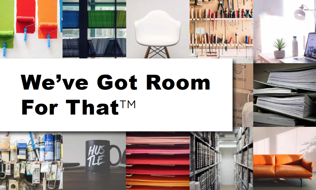
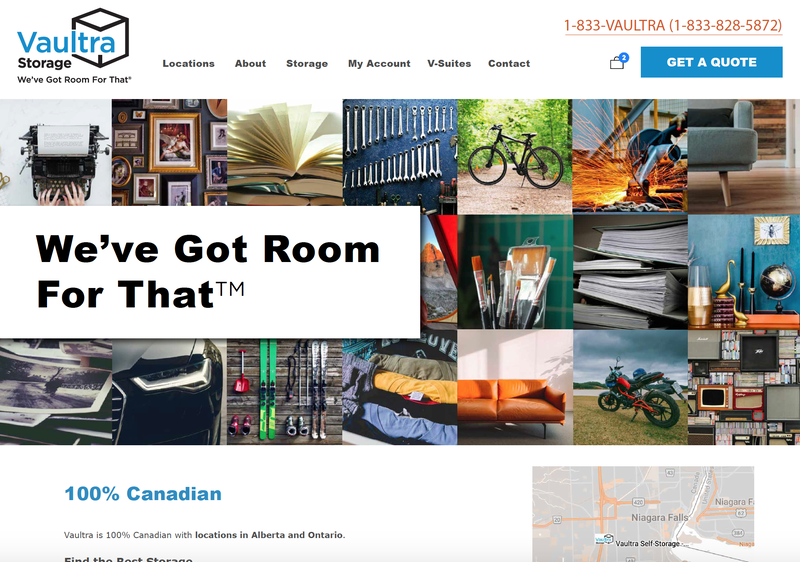
One of the main struggles that the storage industry has is with the perception that it is shameful to have so many material goods that you need access space to store them. With the Marie Kondo fuelled Minimalism movement, many are trying to live with less. There is a perception that storage is about hoarding and at worst criminal activity. To address the stigma attached to the storage industry, Sarah came up with the artistic direction to have collages that will be part of the Vaultra branding, containing photographs of items commonly found in storage in their original context. This is meant to remind prospective customers of the value of their possessions; the functionality, the memories and joy they spark. Thus removing the shame and stigma that surrounds storage. These will appear on the website and carried over throughout social media marketing and print collateral. The stacked cube shapes that make up the collages are a reference to the icon in the new Vaultra logo as well as the storage units as containers in and of themselves. This is a completely fresh aesthetic for the self-storage industry, which has been previously dominated by loud primary colours, chunky fonts and staged stock images of people and brown boxes. These collages will be carried throughout Vaultra's digital marketing, including in a series of Instagram shorts like the sample below.
More Creative + Design projects:
