Sarah has been the Creative Director at Peerage Capital since 2017. This role has afforded her an exciting, entrepreneurial, agency-like opportunity to provide marketing, art and creative direction and consulting to multiple brands. The Peerage portfolio includes companies involved in pre-construction and resale real estate, wealth management and self-storage.
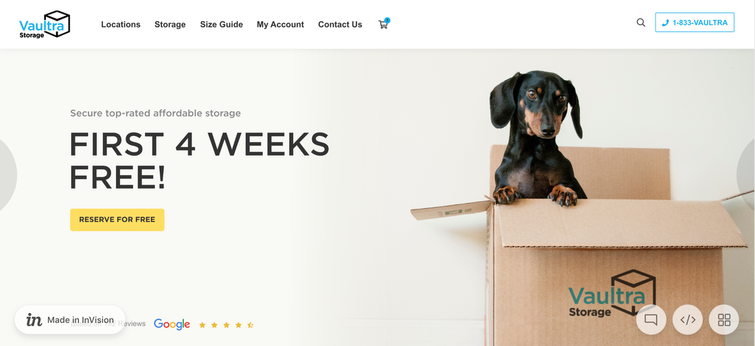
In 2019 Sarah led the rebrand for Peerage's self-storage partner, Vaultra Storage. The project involved designing a new logo, providing creative direction for facility updates, leading the redesign of a new website (slated to go live in September 2019) and guiding the Vaultra Storage marketing team towards improving their social media strategy. Vaultra Storage is a growing Canadian storage operator with nine facilities across Ontario and Alberta, mostly in rural communities. They are rapidly expanding into urban markets with several high profile plots of land slated for development in the GTA.
The strategy for the new website was to ensure it was UX optimized, to include e-commerce capabilities and to establish a fresh, modern and approachable look for the brand that would appeal to customers in the urban markets, that they are entering in 2020, yet to not alienate their existing rural customer base.
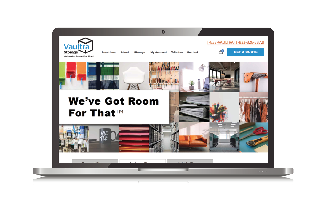
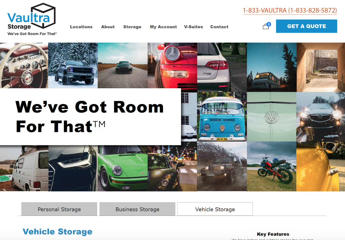
One of the main struggles that the storage industry has is with the perception that it is shameful to have so many material goods that you need access space to store them. With the Marie Kondo fuelled Minimalism movement, many are trying to live with less. There is a perception that storage is about hoarding and at worst criminal activity. To address the stigma attached to the storage industry, Sarah came up with the artistic direction to have collages that will be part of the Vaultra branding, that will appear on the website and carried over throughout social media marketing and print collateral. The cube shape in collages is a reference to the icon in the new Vaultra logo. The stacking of rows of lined up cubes is meant to represent the idea of containers and the storage units themselves. Inside each cube are photographs of items commonly found in storage that would belong to Vaultra's full range of customers. This is meant to remind prospective customers of the value of their possessions; the functionality, the memories and joy they spark. Thus removing the shame and stigma that surrounds storage. This is a completely fresh aesthetic for the self-storage industry, which has been previously dominated by loud primary colours, chunky fonts and staged stock images of people.

These images below are of the Vaultra website, which contained busy graphics, non-unique outdated stock imagery, too much text and had an incredibly hurtful loading time, amongst other damaging UX flaws and technical issues. The Vaultra team is thrilled with the new site design and look forward to seeing a decrease in bounce rates, increase in average session duration, repeat customers and conversions. The new functionality that allows customers to seamlessly rent and reserve right on the site ,as well as purchase moving supplies, will yield incredible ROI from the rebrand and new website and help ensure quick occupancy for the 2020 urban facilities.

Click on the button below to learn more about the Vaultra rebrand process.
More Creative + Design projects: